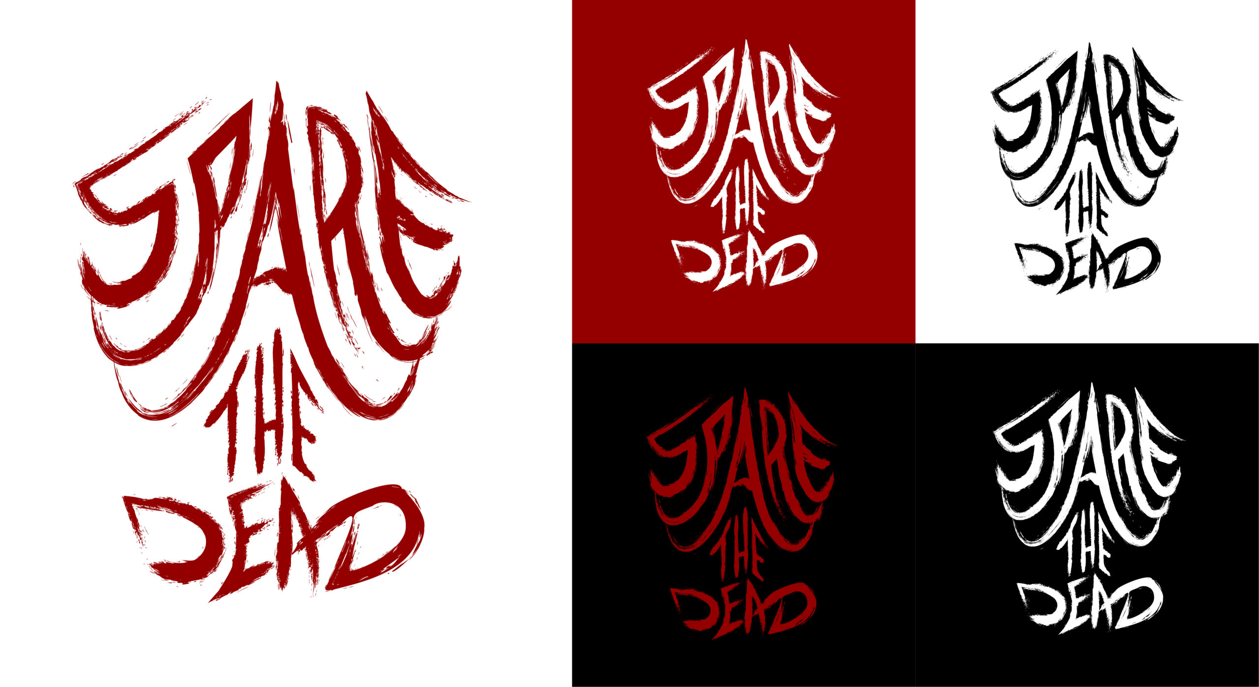
This was a project for the metal band my brother is a member of. They were using a rugged Microsoft font for their logo, but after gaining more of a following, they decided they needed an upgrade. They wanted something that screamed metal. I decided to keep the rugged look and create some lettering that is reminiscent of a partial skeleton.

Because the logo has an implied skeleton, it gave me a nice opportunity to create a secondary logo which has the added skull and arms. This secondary logo can be used in different applications where more detail is visible and even works on guitar picks very nicely!


Original logo sketch:
