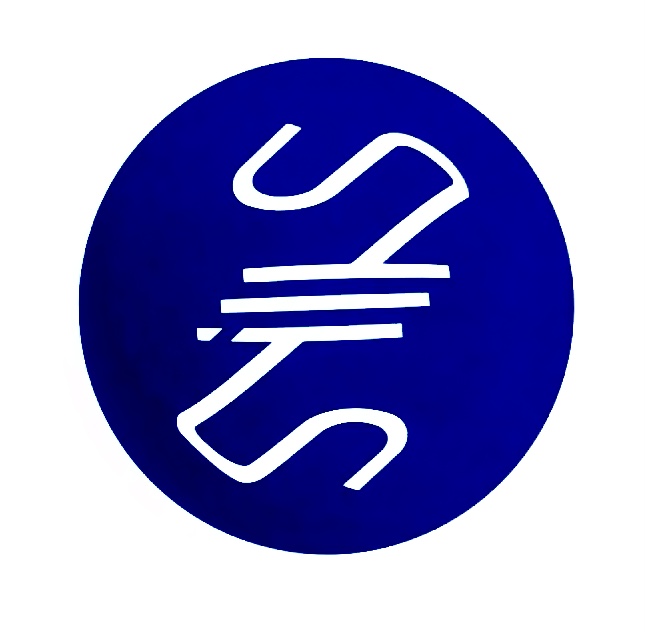
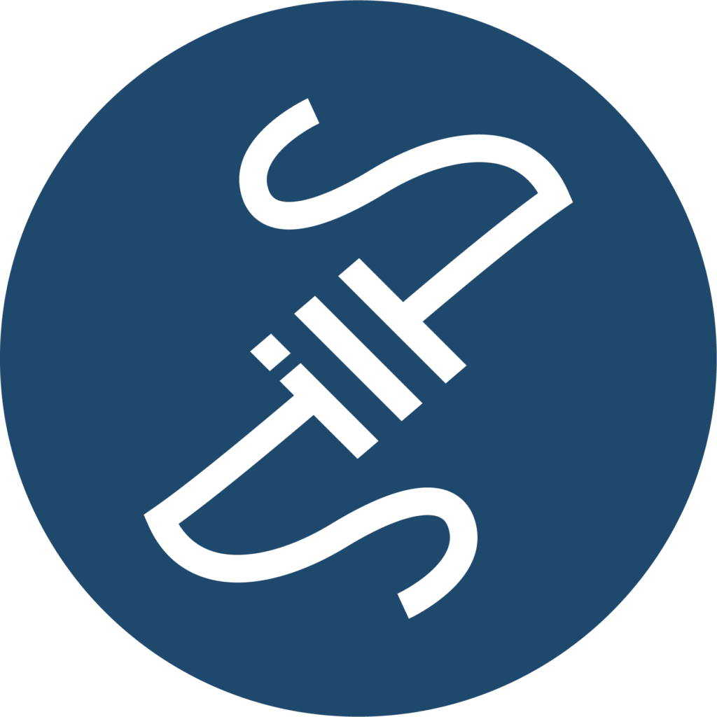
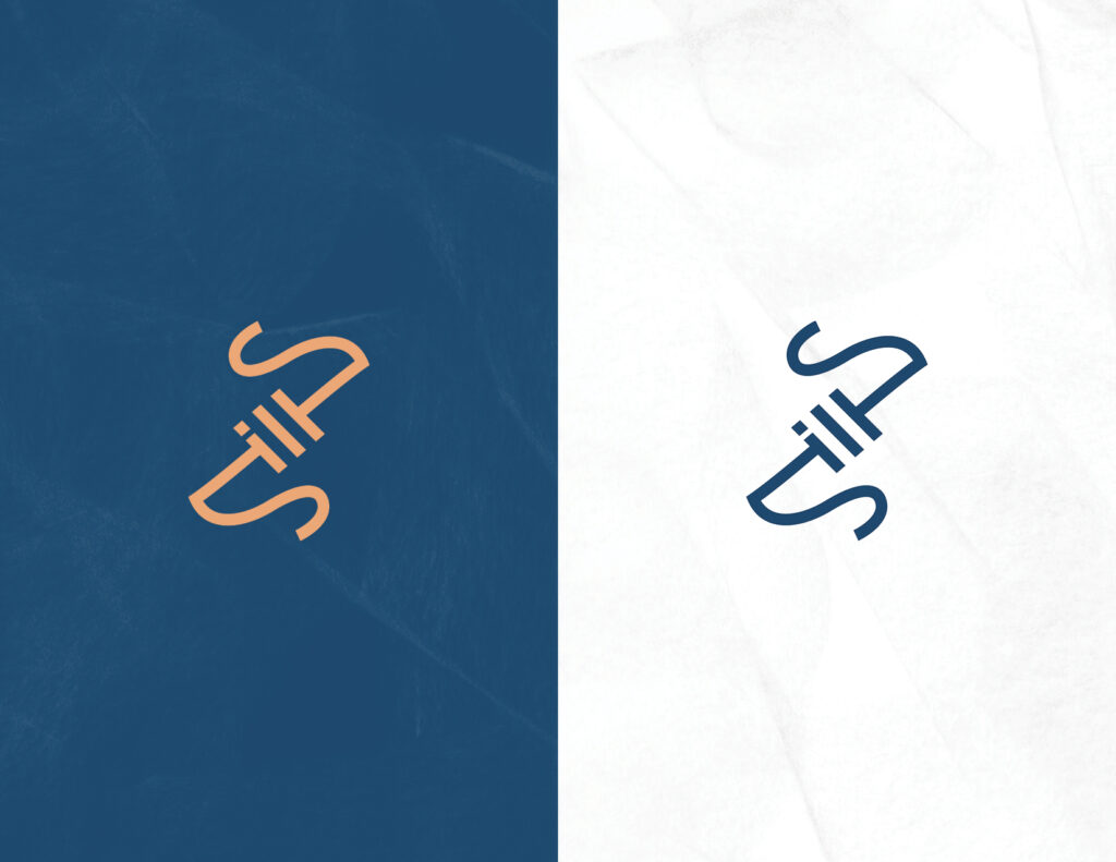
A new personal logo is something that had been in the works for a while. It is tough to come up with a mark you believe symbolizes yourself and your work. While sketching some things down one day, I came across an interesting look when connecting the letters in my last name “Sills” (see sketch process below). I kept fiddling around a little more and started to see a letter “Z” as well. I kept pushing it further until I had something I could try bringing into illustrator. I tried out some envelope distort in a circle and was liking where it was going, I eventually found what I looking for and traced over with single stroke weight lines and touched up the corners to bring out the “Z” a bit more. I finally landed on, what I think, is a successful, clean logo where the primary focus (the letter “Z”) and secondary focus (my last name, “Sills”) are balanced and legible. I think the logo portrays an artistic personality with calligraphic looking “Z”.

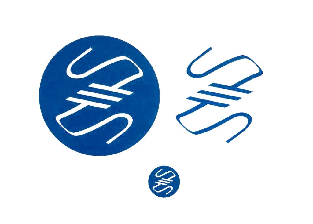
Logo development process: